I built ShareIt primarily as a personal utility, but I wanted to have a good looking interface nevertheless.
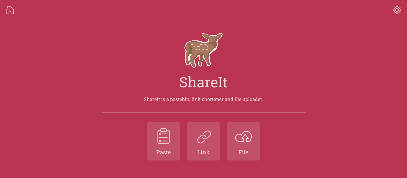
The default theme for ShareIt is a cozy red, using a “glass” style background for visually distinct elements. The home screen presents three primary buttons for the user to choose from. (Note that the mascot is not my own work, it was done for me by a friend).
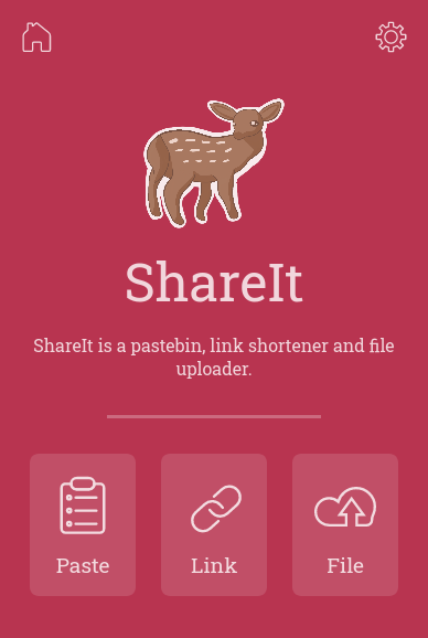
One of the main ways I use ShareIt is to transfer files from my phone to my computer, so it was important that it had a good mobile interface. The home screen responded well with few adjustments, but I had to make the action buttons a little smaller.
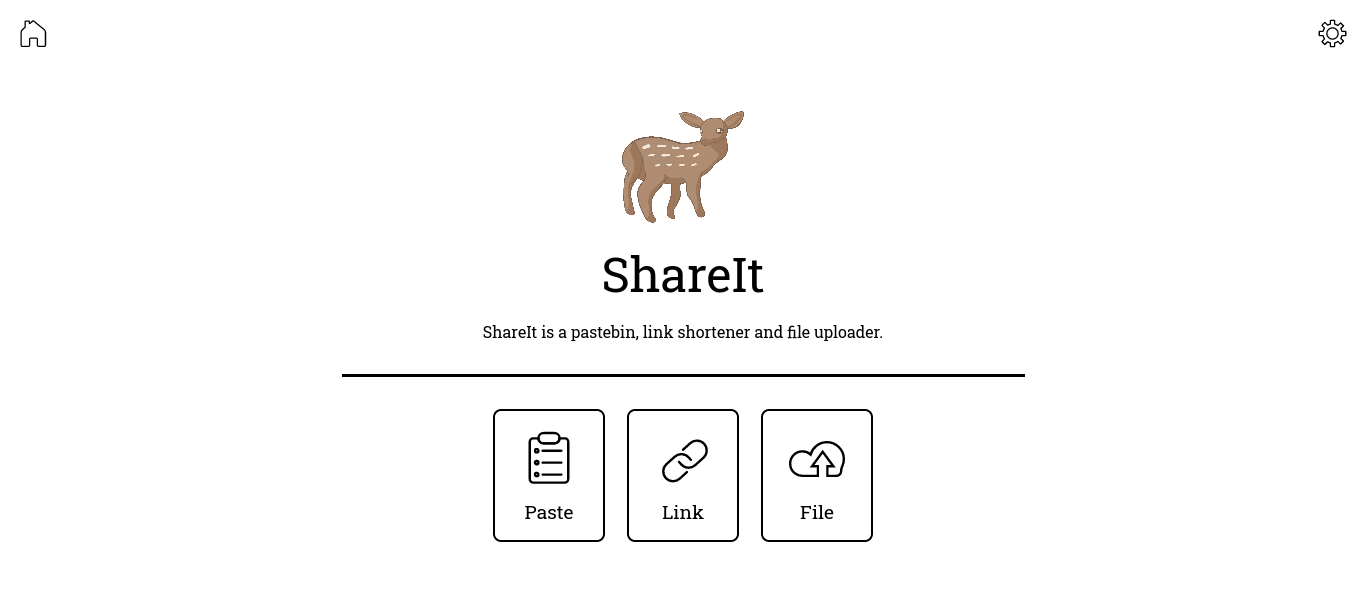
I was undecided about the best colour palette for the app, so I made it possible to switch between three alternate themes. This is a very minimal plain white theme.
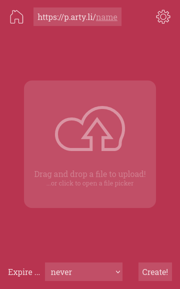
The file upload page on mobile makes it as easy as possible to work out where to click: a button with obvious iconography takes up almost the majority of the screen. Less important options that are not required are kept out of the way, at the top and bottom of the screen.
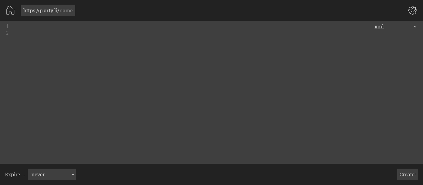
Another feature provided by ShareIt is the ability to paste arbitrary text (often computer code), and get a link to access later or share with others. Again, the text entry element takes up almost all of the screen, allowing the user to view and edit their text easily before uploading. This screenshot also showcases the dark theme.
The app is available here.