I built this site to show off my various web design projects. No screenshots here, see for yourself! The colour scheme is based on Ethan Schoonover’s “Solarized” palette, which is intended to mirror the contrast of a book being read in the shade. I picked just one of the accent colours for this site, to keep a minimal feeling.
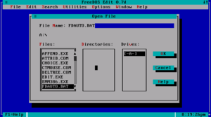
The font is called Fira Code, and combined with the use of basic block colours it is meant to be reminiscent of a Textual User Interface, common in early computers. Most TUIs are more crowded, but I didn’t want to sacrifice user experience for the aesthetic.